Today’s Music Choice
“To Whom the Stars Belong” – this is some atmosphere-setting theme music for the drekoran city of Ekrett. The drekoran are a naturally curious species, and have built up an industrious and inquisitive society on the icy mountaintops of Sevurox, high above the clouds. The drekoran have a long history of studying the night sky, and were the first scientists to propose the space program over 200 years ago.
Progress Report
The progress section this week will be brief, as most of the stuff I worked on was general housekeeping and bug fixes in the background. So, to give some meat to this post, I’m going to show off something a little more fun after the following paragraphs.
Most of my time was spent fixing bugs as they rose to the surface, which is a constant fire that devs are used to fighting. First, I finally wrote a quick scheme to encode “calendar” information into the player’s save data, so I can actually start building a multi-day game loop and have an illusion of progression for my testers to try out. Basically, instead of saving the entire calendar into the data, I like to de-couple the raw calendar from the player’s effects on it. In this case, I have a few flags that can be applied to each calendar event: has it been started, has it been finished, and (in the case of away missions), what allies has the player sent off to complete it? The actual details of the event don’t need to be saved, because they should always be the same. Plus, if I need to patch a change to the event, I don’t need to worry about what to do with regurgitating bad data into the newly “fixed” calendar.
In general, I try to serialize (“save”) as little as possible. Anything that is static, pre-calculated, or could be changed in a future update, I let the game create. This goes for things like character stats, especially. I could save all those HP/SP/etc. values and then reproduce them when the game is loaded, but it’s much easier and more reliable to just store the character’s level and class, and then use that data to generate their stats when the game is loaded. That way, if I want to tweak stat growths for classes in the future, everything will adjust automatically when the player restores their save game. Less is more, sometimes.
Also, I ran into a brutal issue where the game stopped storing the player inventory after I implemented some code to start off characters with a “default” loadout. I spent way too long trying to track down this issue, and I still feel wary about my fix. Such is life.
I also worked on designing a new battle map, mostly so I could test the connective tissue I’ve built that leads the player from the main preparation scene, to a battle, and back. I’m planning to go into great detail about how I designed that scene, so, keep reading. It’ll be worth it!
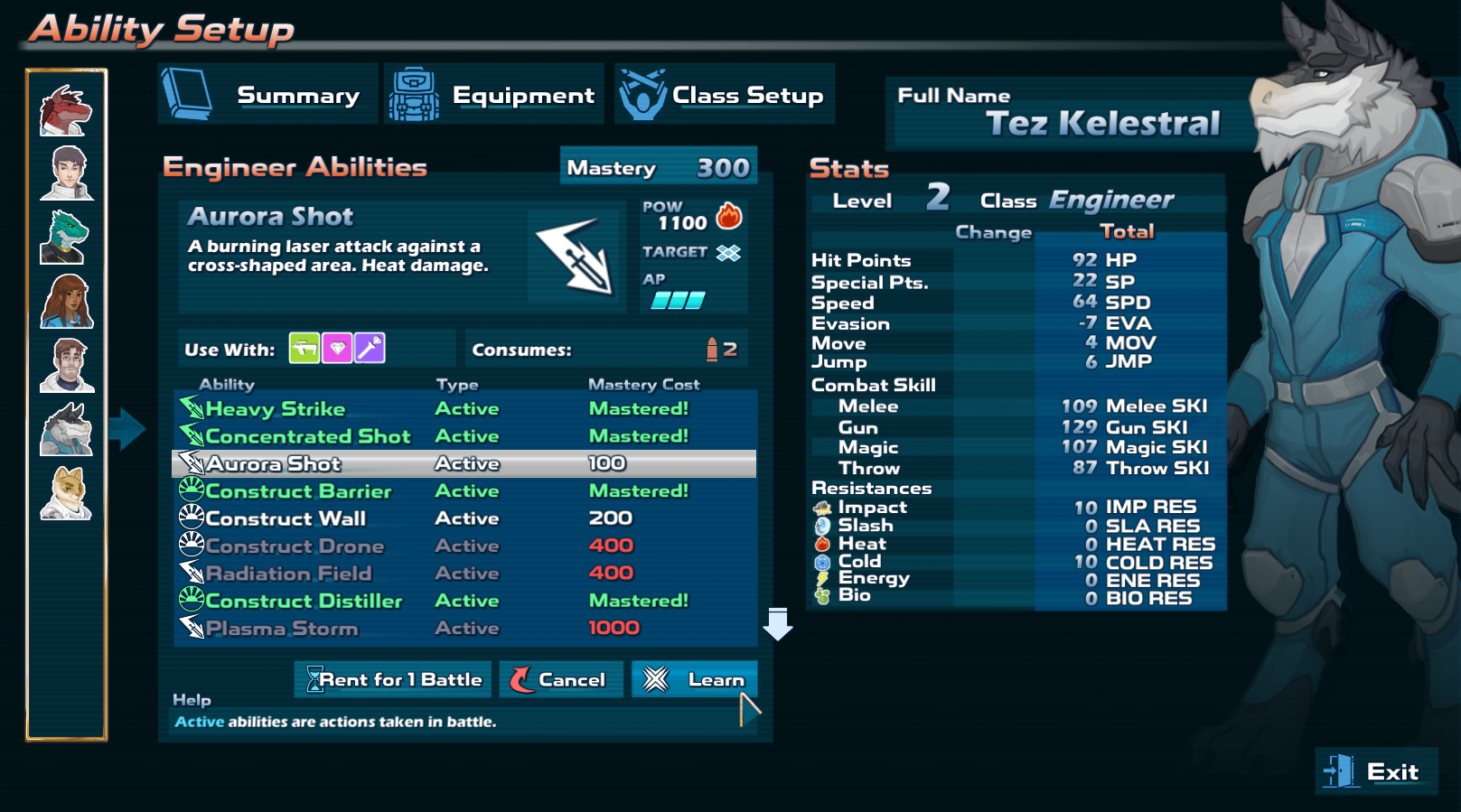 Lastly, I made a few UI adjustments here and there. These will be ongoing over the next… *checks watch* year and a half of planned development time, and that doesn’t even count polishing things. Most notably, I added the character’s class name to every progression screen, since it was something I immediately found myself wanting as I was playing around with classes and gear.
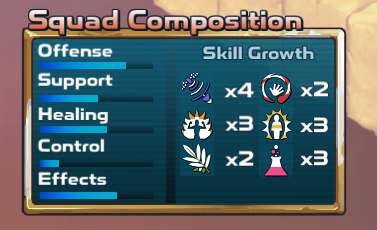 I also added a “composition” graph to the pre-battle deployment screen. This will give the player a rough idea of the makeup of the squad they’ve deployed. It also outlines the skill growth to expect for your allies when the battle is won, so you can stack your squad a certain way if you want to increase certain skills more than others.
This week, with the character starting data/gear in place, I’m going to tackle the first bits of the actual game content. Specifically, the opening story introduction, the faction choice screen, creating a default party based on that, and the “commander” character creation segment leading into the start of the main game.
Let’s Build a Battle!
Recently, I acquired a few new art assets that I wanted to play around with – specifically, props to be used in desert battle scenarios. I wanted to try building a new battle map as I mentioned above, so I decided to get them both out of the way, and document the whole process at the same time!
Basically, I designed a simple battle map from the ground up, completely off the cuff, and then implemented it in the game over the course of about 2 hours. I have a pretty specific and detailed workflow I’ve created for myself to add battle maps, but the good thing is that, as you’ll see, I have a pretty quick turn-around time from concept to execution, which should make building out the real game that much faster.
If you’re interested in that sort of madness, I’ll go into staggering detail about it now. If not, come back next week!
Step 0: The Scenario Design
The first thing I do is quickly scrawl out an idea for the battle scenario in a very basic diagram, using the battle system quirks (or “gimmicks”) as a sort of toolbox for what I want the player to be aware/take advantage of. The second consideration is making the battlefield “make sense” – that is, making it look like “something” other than a nondescript arrangement of landscape features.
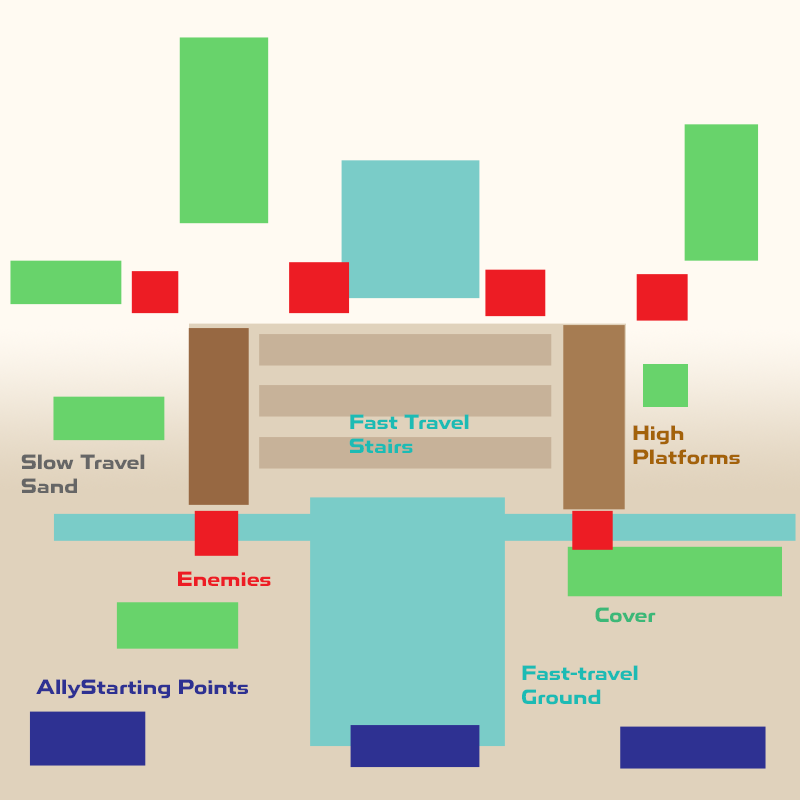
So, here’s my diagram. Basically, it’s meant to resemble the front of an abandoned temple buried in the desert. The main gimmick is three “lanes” leading to the high ground. The lanes on the sides are harder to traverse since you’re walking in sand uphill, so those tiles have movement penalties. There is a stone path that runs in front of the main area, and up the center, and these tiles are faster to traverse. The downside to taking the center is that you’re more open to attack, as there aren’t as many cover spots and you’re surrounded by enemies. The idea is to get to high ground as soon as possible so you gain an advantage over the enemy.
A technical limitation to note as well: since this thing is isometric, farther-away tiles also tend to be “higher up” tiles. Designing around this will help prevent units from disappearing behind terrain, but has the side effect that one side will always be fighting a literal “uphill” battle. Usually, the player starts out at the disadvantageous side, so that’s what we see here. Final Fantasy Tactics was in 3D, with a rotating camera, so it generally didn’t have to follow this rule. However, its sequels and even Tactics Ogre were made of 2D static maps, and once you’re aware of this design limitation, you’ll never be able to un-see it. It’s not a totally bad thing, though, as it lets the player focus on the game board as a static entity rather than having to constantly swirl the camera around and “guess” distances over uneven polygonal tiles.
Step 1: Starting Out
Now, I open up the game engine and I make a copy of my “template” scene. This is just an empty 12×12 (actually it’s 13×13, because I’m counting up from 0, haha I’m terrible) tile region floating in space, with all my logic processing and UI prefabs already in place. Every battle scene will start out the same way, and because everything is a prefab, any changes I make to one UI or logic element will propagate across every scene I’ve already made.
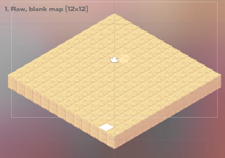
I am using some plain “sandy” tiles for the ground, and I set the skybox to a nice rosy pink color for contrast. I’m not going for polish here, as you will see. This is purely for rapid prototyping, so things will get sloppy from here on out.
Step 2: Setting the Terrain
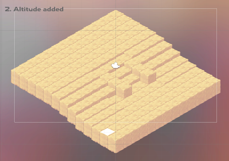
Here, I use the built-in tile snapping feature to set the tile altitude and give the slope effect I desired. I made the height difference more shallow than usual since a character’s “jump” stat dictates the highest tile-to-tile height they can traverse, and I didn’t want too sharp of an incline in a small space. The final difference is still a good 11 units or so, which is more than enough to give a combat advantage from above. The two protrusions are meant to be stone, with stone steps in between them, but since I’m just winging it, I don’t bother with additional artwork on those.
Step 3: Transposing the Design onto the Real Thing
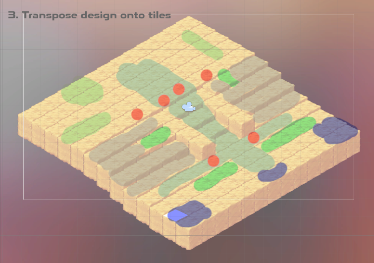
Here, I take a screengrab of the tile map, and I paint my design onto it. This will help me as a guide when I’m placing props and units, and setting tile data. There’s no reason to draw the initial design as isometric, unless you want to give yourself a headache before the fun has even begun.
And now, the arduous process of encoding the data and adding the props.
Step 4: Building the Actual Map
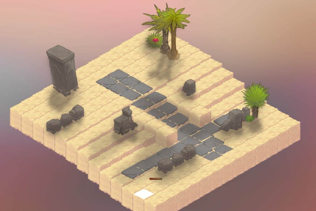
Well, maybe not an entire hour. I ended up obsessing over some of the placements and fighting with the way things are layered (it’s still not perfect), and eventually had to restrain myself. So, here’s where we’re at now.
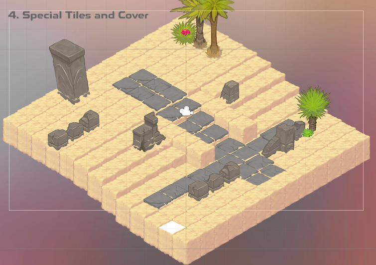
That’s getting somewhere! I wish I had more tile textures to add variety, but like I said: rapid prototyping. Still, the cover spots are obvious, and the “fast” tiles are marked with stone. I also added in a little foliage for some color.
What you can’t see (and what took a bulk of the time) was applying the meta-data to each tile. The graphics on top are more or less just decorations; the tiles themselves house the data that makes the game function. This includes traversal speed (called “weight,” where passing over the tile consumes a certain amount of weight off the unit’s movement range), whether it’s a cover tile, whether it’s a barrier of some kind that blocks line-of-sight, and cosmetic bits like the info that shows up in the “terrain” box when you put your pointer over it.
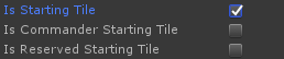
Fortunately, I’ve set it up in such a way that most of this stuff can be done through the editor. I can also flag tiles as potential starting points for your own allies, and for maps where the commander is required, I can mark a tile as their starting spot, too. Same goes for guest characters or required allies who aren’t the commander (“reserved” starting tiles). It’s a combination of visual and programmatic that I find comfortable to use. I warned you that there would be madness involved.
 I also used this opportunity to encode the “encounter” and “enemy” data. This part is done purely in code, and not through the level editor. Basically, an “encounter” object stores all the information about the battle – the enemy units, the size of the player’s party, the map scene to use, the rewards, and the objective.
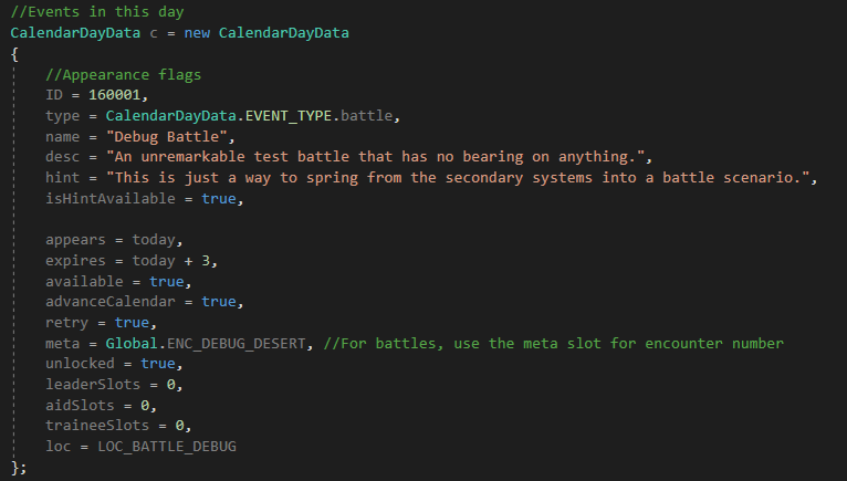
This manifests as “days” on the calendar, which you can see in the nasty, raw code on the left side. So, a day potentially holds an encounter, and an encounter holds enemies. Makes sense, right? And, the “calendar” I mentioned in the progress report is made up of these “day” events, which the game processes into an order that is essentially the backbone of the player’s experience. We’ve come full circle, now!
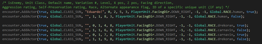 And, in case you were really curious, enemies look like that mess on the right. Instead of picking one up and dropping it onto the scene visually, I create them out of a bunch of numbers. In this case, I’m creating 6 enemy units and adding them to the encounter. The first is a Sunspell I’ve named “Eduardo!”, who will start at location (5, 3) and face down and right by default. Any blank or negative data is basically a flag for “I want this to be something random,” so don’t worry about those. Anyway, by doing it this way, I can reuse maps with different arrangements of enemies, without having to create multiple copies of the same map to handle every encounter.
I can also use this method to add “guest” characters who fight for the player but cannot be directly controlled. Usually, when a guest’s turn comes up for the first time, they will ask the player (or, rather, the commander) what they should do. The player can instruct them to be aggressive, or to try to stay out of the way, so there is no fear of a “berserker Rafa” scenario. Though, I don’t think I’ll have any escort missions like that at all, since they’re always extremely annoying.
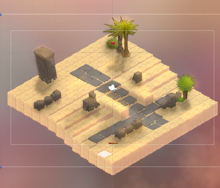
Tangent aside, here’s what it looks like now. It’s starting to look like an actual game! (Don’t mind the placeholders or any layering errors.)
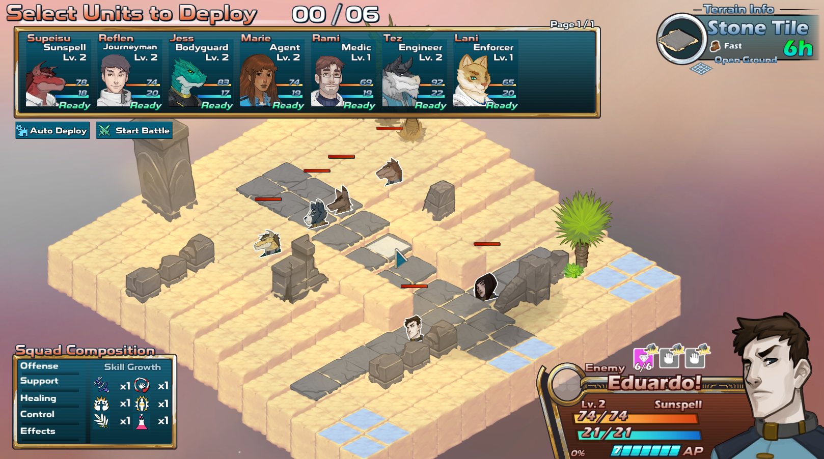
Not bad! All the enemy units are out in the right places, with our buddy Eduardo! standing at the front of the pack. The player’s potential starting tiles are shown in blue (refer back to our original design), so this way they’re forced to split up their allies across 2 or 3 lanes and attack from multiple angles to keep things spicy. I made all of the enemies the Sunspell class out of sheer laziness. Say it with me: Rapid. Prototype.
Step 5: A Little Bit of Polish
At this point, I would playtest and make sure I’m happy with how the map works: making sure the AI doesn’t get hung up on the terrain and ensuring there are no obvious exploits or wasted space. Then, I would set to work on making the thing look decent: adding variance to the tile textures, filling out the undersides of the map so it doesn’t look like a weird floating carpet, adding foliage and details around the borders, and dotting the ground with small plants and other details. That takes time, though, so I’m not gonna do that.
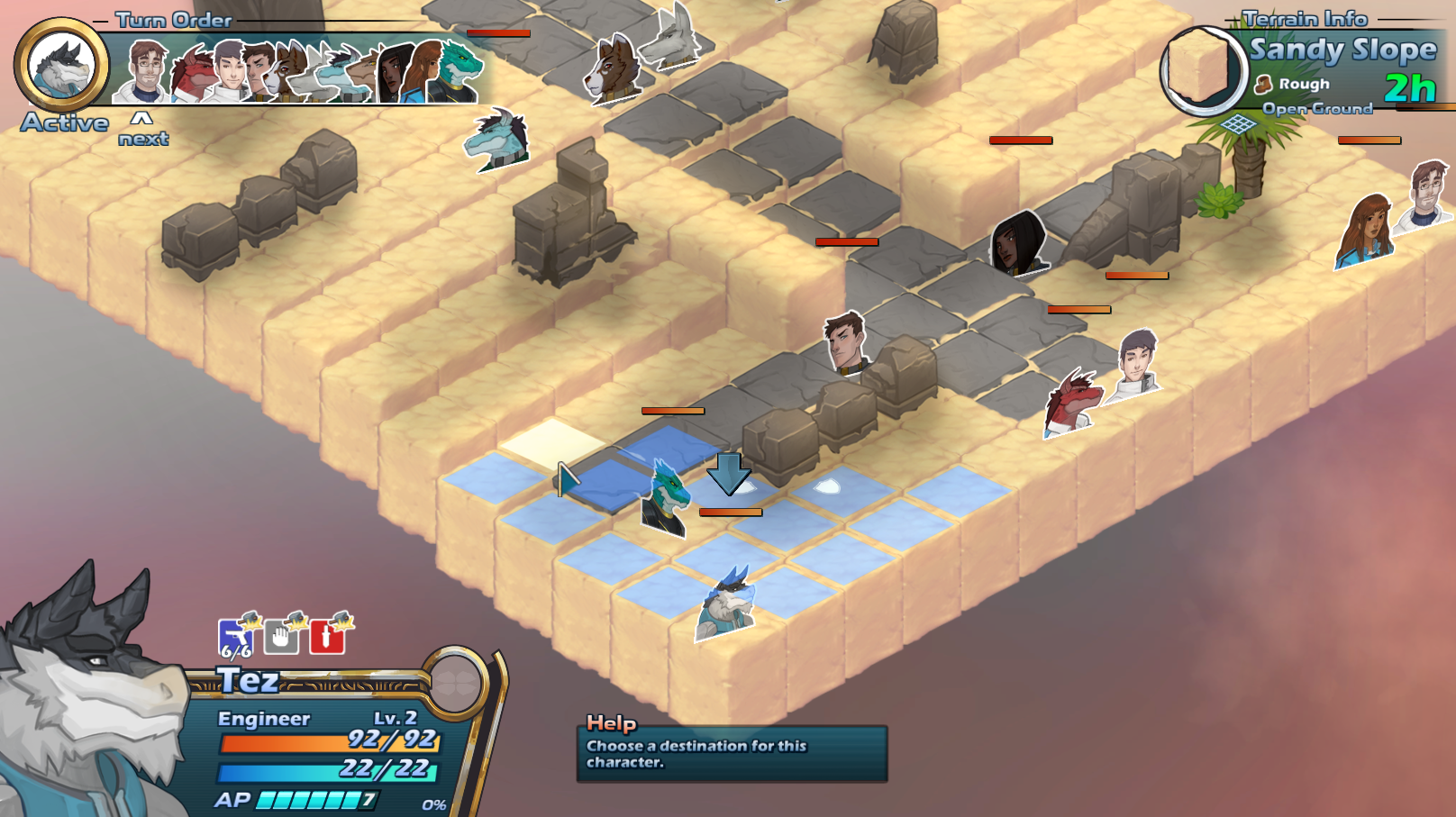
What I will do is one quick and easy trick to add a lot of texture and character to the map, and it’s one I used liberally in The Tenth Line as well. Specifically, I will add a “highlight” and a “shadow” layer over the whole map, and use this to give the presentation some life and tone.
First, I’ll grab a screenshot of the entire map to use as a guide. Then, using my favorite layer-based art application, I paint some shadows onto the world. Nothing too finely detailed or realistic; I prefer things to be mildly impressionistic anyway. If I was going to fuss over abject realism in the shadows, then I would project actual shadows and entrench myself firmly in the uncanny valley that is low-budget game lighting. Plus, I’m in a hurry. For the real thing, I would take my time, and keep the sloppiness to a minimum. The important thing is that I need to be happy with the map design before I get to this step. Otherwise, if I change any of the props or layout, I have to do it again.
Now, I bring this painted shadow layer into the game with a “multiply” blending layer, which generally darkens things.
Looks okay, right? The edges are a bit soft, considering it’s a desert, but like I said, it’s just for texture and not for realism at this point.
Next, I do the same for highlights. This will go into an “additive” layer over top and will add some sun-spots on the ground and a sort of bloom or glare effect on reflective or light-facing surfaces. I try to be more gentle with this since it’s easy to get carried away and assault the player with too much glare at once.
Lastly, I also add a pinkish-orange gradient over the top of everything to subtly tint the map and all the characters. And, for kicks, I add a particle effect of sweeping sand blowing over the battlefield. Spoiler alert: atmospheric particles are basically the equivalent of standing off-stage and throwing white confetti in front of a giant fan.

That’s it for polish that I feel like adding today! It’s certainly more lively than what we started out with. I could do better, and I probably will as I get more accustomed to building maps and capturing the “look” I want, in my control-freakish nature.
And that’s one way to construct a map in your tactical RPG! Thanks for hanging in there. Next week’s super-secret reveal will be even more fun, I hope.


